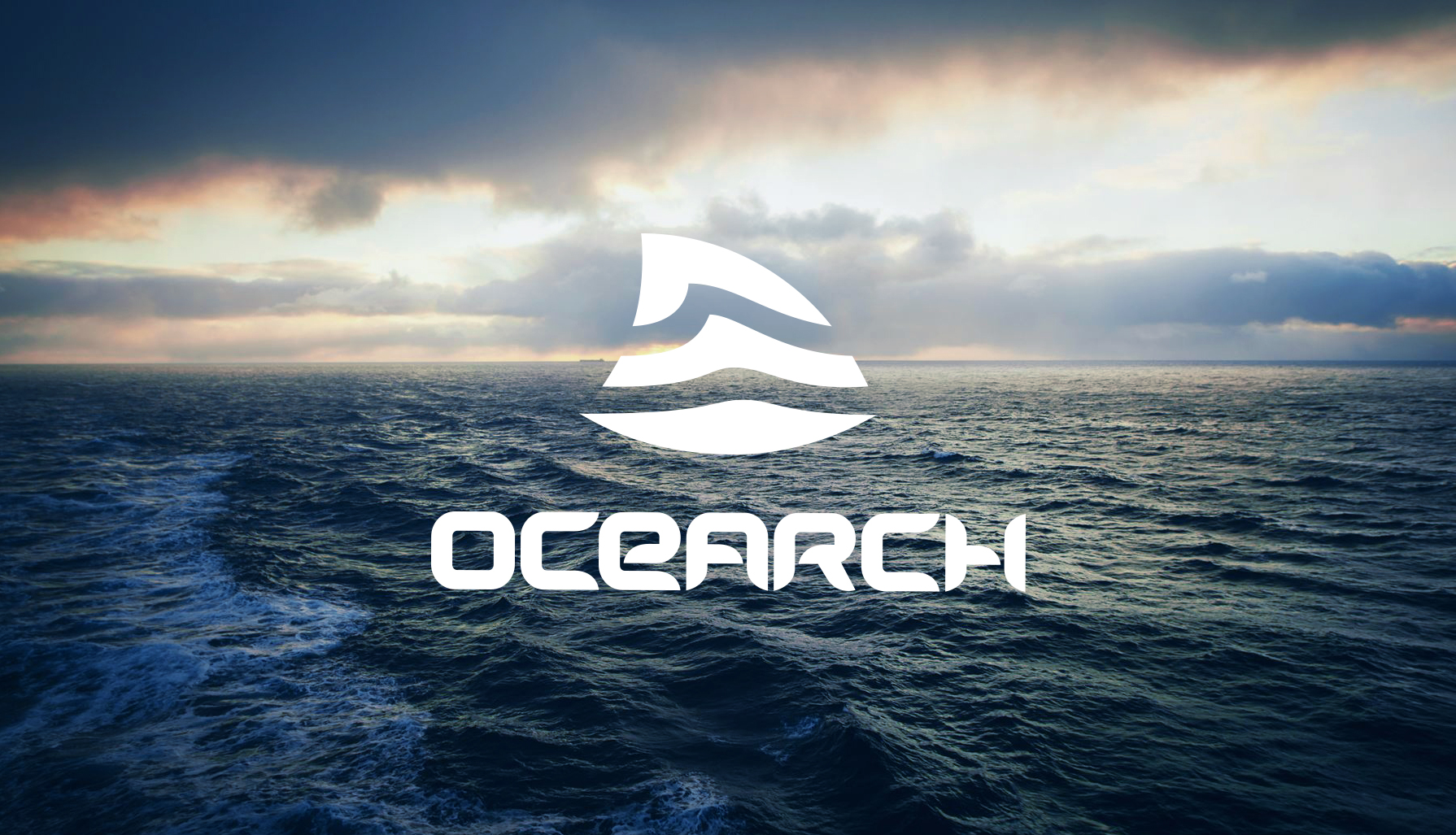
OCEARCH
Brand Identity, Digital Design
Brand identity for science and data organization who’s mission is to return the ocean to a state of balance and abundance.
Client
OCEARCH
Sector
Science & Data
Discipline
Brand Identity, Digital Design
Year
2018
Art Direction
Tommy Chandler
Fernanda Ubatuba
Chris Fischer

OCEARCH is a world organization of scientists that are using data to help return the ocean to balance and abundance.
While the client wished to keep the OCEARCH wordmark, they also wanted a new brandmark and visual identity that could be optimized for use everywhere around the world – responsive in digital, and to allow for the brand to diversify into many products and services.
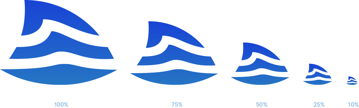
Building the Mark
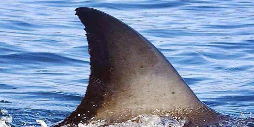
In showing the OCEARCH logo one can start with the image of a shark dorsal fin.

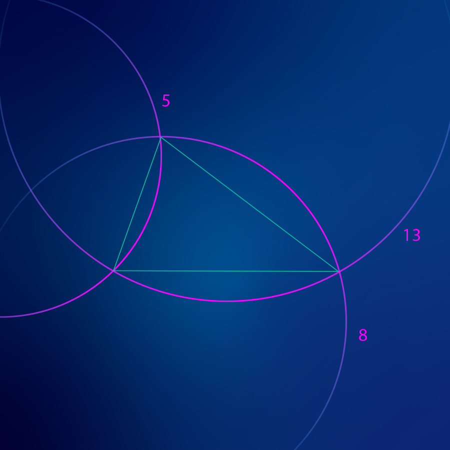
Congruency
The shape of the fin is similar in proportion to a congruent triangle. Congruence is the state of coming together as defined by three points. It is inclusive. This, in many ways, is the starting point for the core design of the OCEARCH brand mark.
Threes
Three is an important number to OCEARCH. The brand mark can be interpreted as having three points, three layers, three concepts etc. The three concepts are:
1. A future of abundance
2. Science & data
3. The story of man’s relationship with the ocean
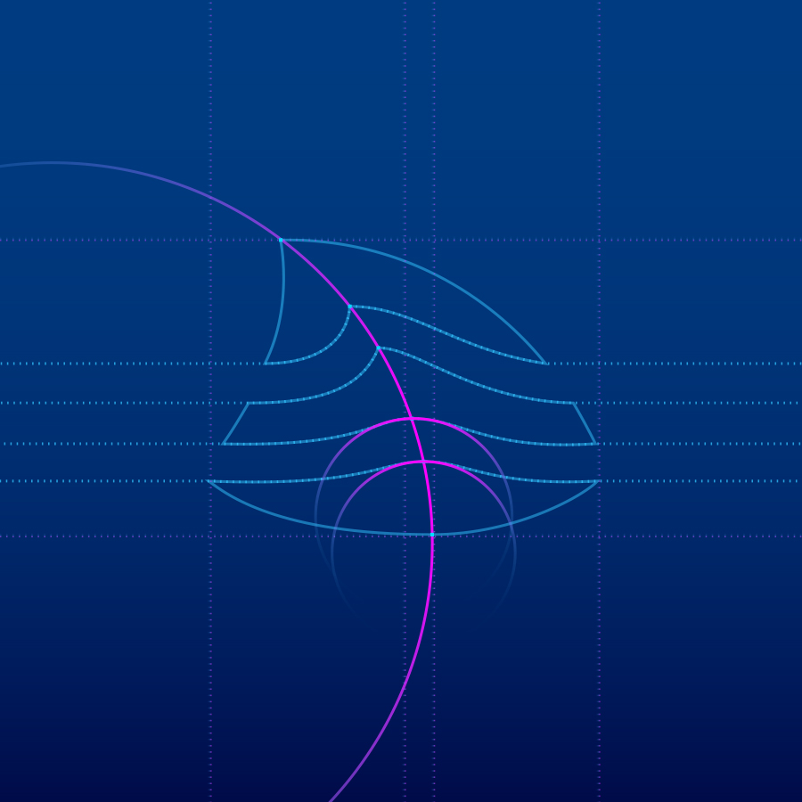
Finish
A wave cuts through the mark, creating parity between the round, bottom area and the sharp, top part. So in addition to building off the three points from the triangle there are also three distinct layer stripes.
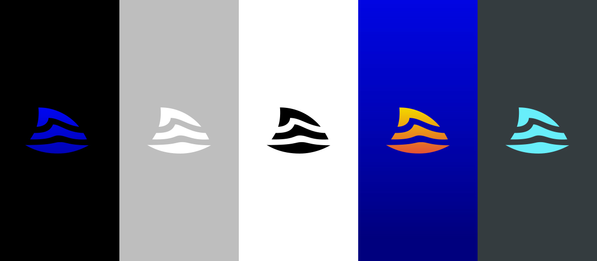
Brand mark color variations
Product Design


Merch

Sueded Tee

Brooke Kanani Bracelets

Meshback Hat

Wound Care Packaging